Core Design Team
Firm: GO’C
JON GENTRY AIA
Partner / Architect
AIMEE O’CARROLL ARB
Partner / Architect
Consultants/Collaborators
CLIENT: MINI MART CITY PARK
ARTISTS & FOUNDERS: SUTTON BERES CULLER
STRUCTURAL AND CIVIL ENGINEER: J WELCH ENGINEERING
ENVIRONMENTAL CONSULTANT: G-LOGICS
KINETIC WINDOW FABRICATION: CHRIS MCMULLEN
LIGHTING DESIGNER: FIXTURE STUDIO
CONTRACTOR: MÉTIS CONSTRUCTION
LANDSCAPE CONSULTANT: WITTMAN ESTES
ENVELOPE CONSULTANT: RDH BUILDING SCIENCE
PHOTOGRAPHER: KEVIN SCOTT
Project Narrative
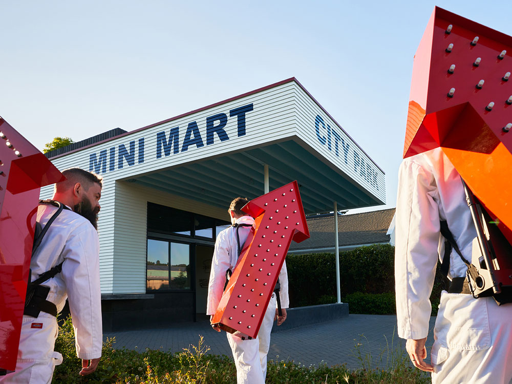
Mini Mart City Park (MMCP) is a new arts-oriented community center in Georgetown. The project, which sits directly across from Boeing Field, has transformed a former gas station site into a Seattle hub for art events and community gatherings. The mission of MMCP is rooted in the belief that it is vital to create community hubs for people to build power and a voice in decisions being made to develop their neighborhoods. MMCP serves as a community-led space advocating for creativity and public health through art exhibits, residencies, environmental action and locally focused programming in the Lower Duwamish Valley. The project and first five years of programming was entirely paid for through fund-raising campaigns and public & private grants.
MMCP stands on a site that was once used as a fuel-storage facility. Ongoing testing has found petroleum contaminants in the subsurface at concentrations greater than Washington’s cleanup levels, which MMCP has worked hard to assess and remediate over the past decade. An air-sparge and soil vapor extraction remediation system was installed as an integral component of the new facility which will allow the owners to effectively clean the remaining residual contaminants in the soil and groundwater passing under the site. MMCP serves as an educational site and case study for how small brownfields may be revitalized in the Duwamish Valley and beyond. Meanwhile, the building creates a space for local residents and visitors to gather, learn about, and participate in environmental action taking place in the Duwamish Valley.
The design work began by exploring options to preserve the existing remnants of the 1930s-era, 450-square-foot filling station. It quickly became evident that in addition to being too small of a venue to host the desired community meetings and gatherings, the structure was too compromised to save. Plans were developed for a new, 1,100-square-foot building and 3,000-square-foot park which would satisfy the desired program and make better use of the site, resulting in more public green space. MMCP sits on a boundary between Georgetown’s residential neighborhood and Boeing Field, Ellis Avenue is a clear divider between these zones. The architecture of MMCP similarly straddles the industrial and residential. The single story scale of the building is at home with its residential neighbors, simultaneously the open park space and strong signage clearly alludes to the public nature of the building, inviting in visitors as they pass by.
By dividing the program functions into two primary spaces, a gallery/community center at the front of the building, and a storage/utility box at the back of the building, an open-air courtyard was created in the middle. The courtyard enables the park and building to work together, merging built space and the park areas in between. The courtyard also serves as a multi-functional exterior space for large-scale art installations, movie night gatherings, and loading access for the main gallery. A 1,000-square-foot rooftop level provides an elevated space for small gatherings surrounded by areas of green roof planted with drought tolerant sedums and space for solar panels. The main gallery space uses a few key design elements to increase the flexibility of the compact space. It includes a large pivoting window (6’-6”-wide-by-8’-0”-high) along the south gallery wall that opens to provide a strong connection to the park and serves as a cafe window during events. The gallery has exposed wood rafters throughout that filter light down into the space via a 15-foot-long skylight. The kitchen tucks into the cabinet wall along the back corner and opens directly to the courtyard through a series of sliding and hinged glass doors. Having large operable windows and doors along three sides allows the courtyard and park to become an extension of the gallery.
From the earliest stages of the design process, references to old filling stations (painted clapboard siding, a large overhanging roof protecting the forecourt, hand-painted signage, and divided metal windows typical of old storefronts), were an important part of the design. These are a nod to the past, albeit a transformed past: a new type of filling station–one dedicated to serving art, community, and civic engagement.


